
11 minute read
Quick answer:
Knowledge graph visualizations are powerful business intelligence tools that offer a visual representation of complex relationships and connections within vast amounts of data.
Free download: Semantic layer whitepaper
Knowledge graph visualization provides your business with a clear and intuitive way to understand and explore intricate networks of data points.
By presenting information in an organized, visually appealing, and interactive manner, these visualizations enable decision-makers to gain valuable insights, identify patterns, and make well-informed strategic choices.
Increasingly, visualization is also the surface layer where teams inspect, audit, and trust the outputs of AI systems grounded in enterprise knowledge.
From identifying customer behavior patterns to optimizing supply chain management, knowledge graph visualizations play a crucial role in solving a wide range of business challenges, empowering organizations to unlock the true potential of their data.
Let's look at knowledge graph visualization, its different charts, uses, challenges, benefits, and tool types.
At a glance
-
Knowledge graph visualization presents entities and their relationships as an interactive network you can explore, rather than rows you have to interpret.
-
The same visual layer now doubles as the inspection surface for explainable AI, showing which sources and connections produced an answer.
-
Uses span search engines, scientific discovery, regulatory auditing, website searchability, and product recommendations.
-
Visual clarity depends on the underlying graph: ontologies, provenance, and a semantic layer keep the picture aligned with meaning.
-
Tool choice splits by need, from databases and data intelligence platforms to dedicated visualization software.
What is knowledge graph visualization?
Knowledge graph visualization depicts a knowledge graph in a visual format. It shows how data is connected in a way that's easy to understand and search.
A knowledge graph, or semantic network, is a medium for displaying real-world concepts represented as data (nodes) and their connections (edges).
A knowledge graph acts as a database. The knowledge it displays is represented as an interrelated set of nodes and edges, each symbolizing an entity.
The edges symbolize a connection between two existing entities. The graphs show how these edges and nodes interact, making it easier for the viewer to understand their relationships.
Think of a family tree. Each person (node) is represented, and their relationships to each other (edges) are clearly mapped out. The same happens in a knowledge graph:
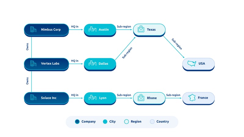
Knowledge graphs can incorporate pretty much anything you could possibly have data on, including:
-
People
-
Places
-
Objects
-
Events
-
Situations
-
And even concepts.
The relationships represented can be as simple or complex as you need them to be.
They can be tailored to your purpose, creating the ideal knowledge graph visualization for your dataset. This flexibility makes them useful for a wide variety of situations.
Knowledge graph visualization serves as a storytelling tool.
Your data exists, but not in a vacuum.
Using a knowledge graph visualization involves putting that data in its proper context and telling a more holistic, comprehensive story about what it means for your business.
How do you visualize knowledge with graphs?
Creating knowledge graph visualizations requires a series of steps, starting with identifying and collecting the entities you want to include in the visualization.
1) Data retrieval and selection
-
Collection: Gather all structured and unstructured data from all databases and other storage locations.
-
Streamline: Remove any irrelevant data, including duplicates.
-
Extraction: Extract entities and relationships from the data.
2) Graph building
-
Construct: Use a graph database and the appropriate tooling to construct the knowledge graph. (A list of the top tools is provided later in this blog post).
-
Populate: Insert entity and relationship information in your knowledge graph.
Choose and build the chart
When constructing your knowledge graph, you also have to decide how to visualize and build a chart, considering factors such as the nature of the data, the intended audience, and the insights you want to convey. (To build a chart, you must extract and transform data from the knowledge graph.)
Several techniques and chart types can be employed to effectively represent the intricate relationships and hierarchies within the data. Here are the most common ones:
-
NODE-LINK DIAGRAMS - One common approach is using node-link diagrams, which display the graph as a network of nodes connected by edges. These diagrams are most effective when visualizing knowledge graphs with complex relationships, targeting diverse audiences (technical and non-technical, e.g. business executives or decision-makers) and aiming to extract insights related to the graph's structure, connectivity, and patterns (e.g., clusters, communities).
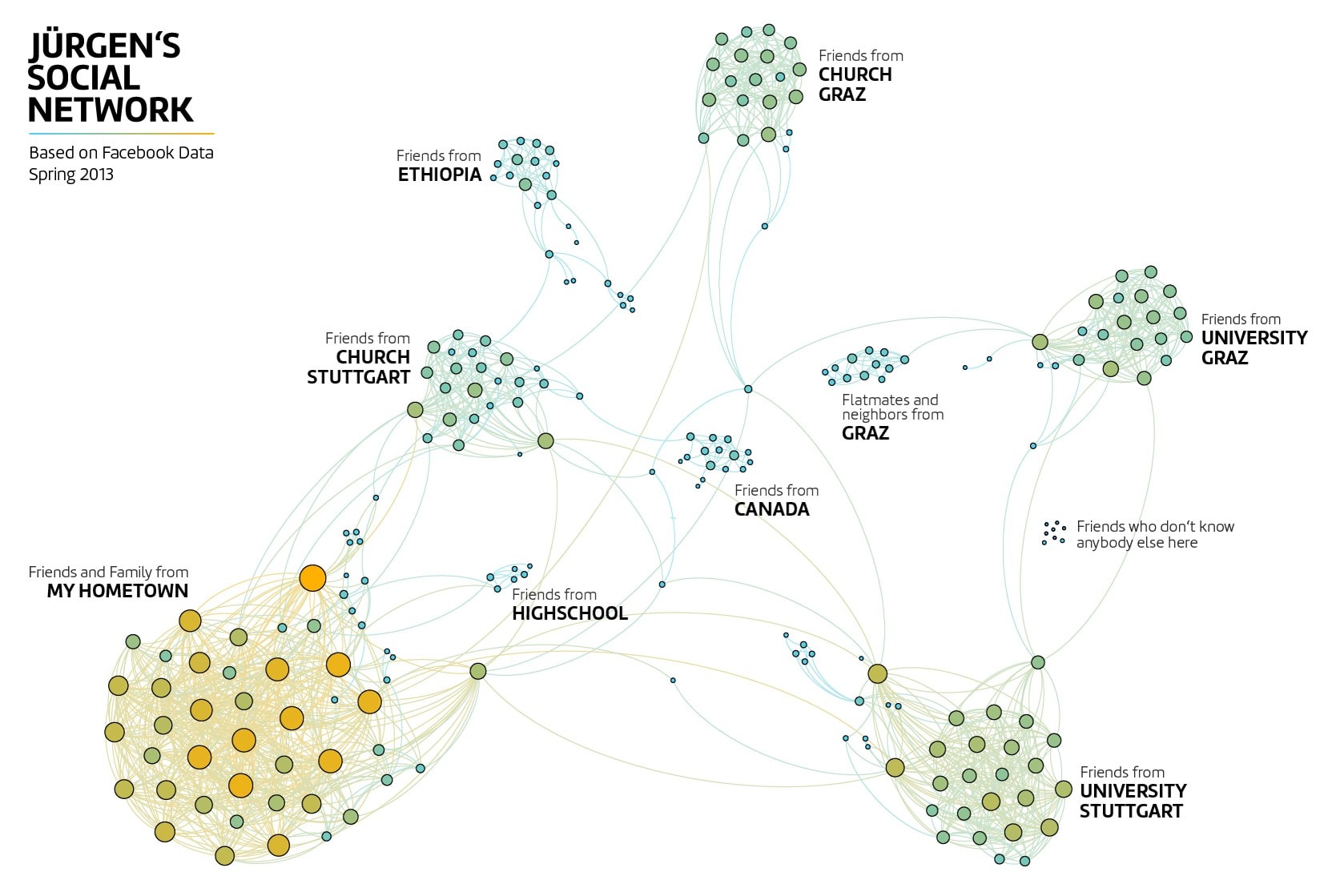
A visualization of Jürgen Röhm social network, based on his Facebook friends in early 2013. Source: Jürgen Röhm
-
MATRIX-BASED VISUALIZATION - Another relevant technique is matrix-based visualization, where the graph is represented as a matrix, with rows and columns representing entities and intersections indicating relationships between them. These techniques are well-suited for tabular or hierarchical data and intended for audiences with varying technical backgrounds (technical or non-technical, e.g., business analysts or executives). They provide insights into the relationships, strengths, and patterns within the graph.
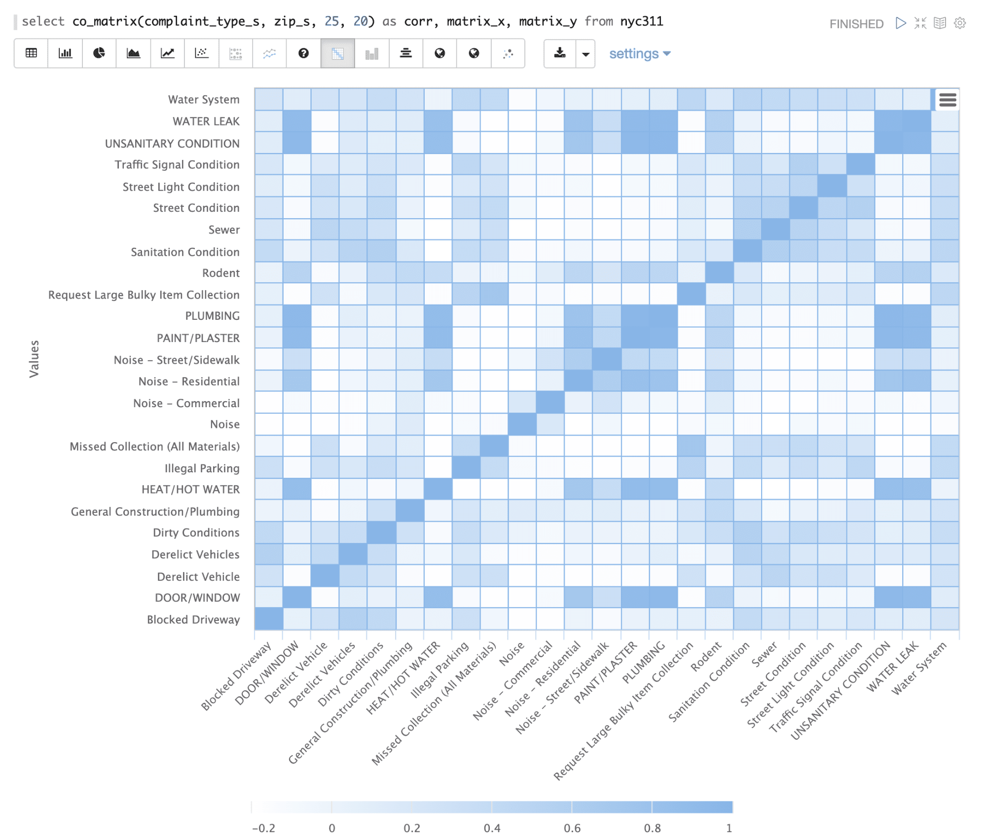
Source: Lucidworks
● TREEMAPS AND SUNBURST - Treemaps and sunburst charts are also valuable for visualizing hierarchical structures within the knowledge graph. These techniques help uncover patterns, clusters, and outliers within the data, enabling businesses to gain deeper insights and make data-driven decisions. These charts are suitable for knowledge graphs with hierarchical or nested data structures and are intended for both technical and non-technical audiences. They offer insights into the distribution, proportions, and relationships within the graph.
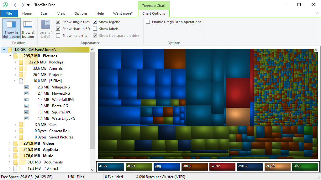 The hierarchical treemap chart shows a coloured square for each folder, file type, or available space on a drive. Source: Jam Software
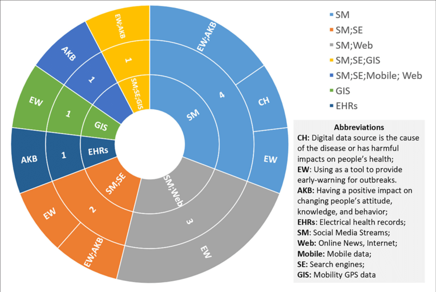
Sunburst chart displaying the impact of each digital source on health emergencies. Source: ResearchGate
3) Graph calculations
Various metrics or indicators can be computed to enhance the graph's visualization.
4) Graph layout
Graph layout involves determining the spatial arrangement of vertices to create a visually appealing representation and help human users understand the underlying information.
5) Rendering
Ultimately, the graph is presented or rendered on the screen for viewing.
At this point, you have the opportunity to analyze your data. You can filter the data, categorize and sort, and draw conclusions from what you see. You can use this visualization to present data-backed stories.
But you have to remember that the knowledge graph must be maintained, updated, and monitored!
Uses of knowledge graph visualization
Knowledge graph visualizations are used across industries, from retail to health care, and can serve many purposes.
Thanks to knowledge graphs' flexible and customizable nature, their forms and functions are as diverse as databases and data sets. Let's review some examples that best illustrate the concept and some of the most popular business use cases.
Search engines
One of the most helpful and universally familiar examples is the kind of knowledge graph used by search engines.
When you search for anything, the goal is to deliver you the most relevant information possible. To do this, search engines use knowledge graphs.
For example, if you search for “Harrison Ford”, you'll get results that relate directly to him, like his photos, his Wikipedia about section snippet, and the most recent news stories about him.
These are all helpful if you want to learn specifics about him, find the latest gossip, or remind yourself what he looks like.
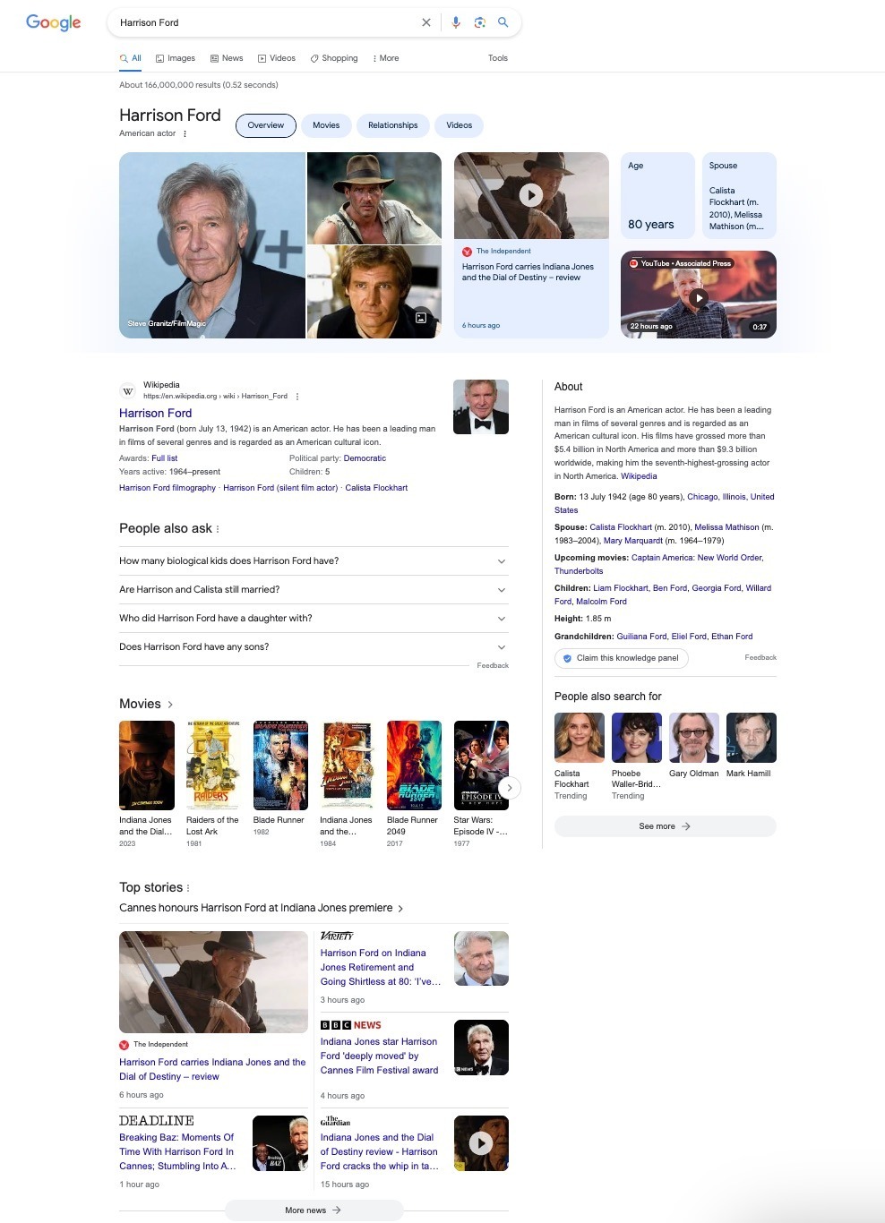
Source: Google
However, people often search for actors' names when they're thinking of a film they can't remember the title of but know who was in it. That's why they provide a section listing all his films, which you can click to learn more about them.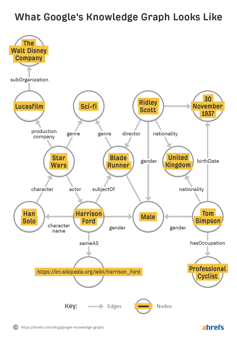
Roche's policy assistance work shows this in practice. Scattered policy content was unified into a semantic knowledge base, so a compliance answer can be followed back to the specific policy supporting it rather than taken on trust.
Website content searchability
Knowledge graph visualization is great for both large and small businesses. It can create a helpful knowledge base, make your content searchable, and improve users' on-site experience.
User experience metrics also help your site rank higher on Google, attract returning customers, and contribute to higher satisfaction levels.
You could use a knowledge graph on your website to:
-
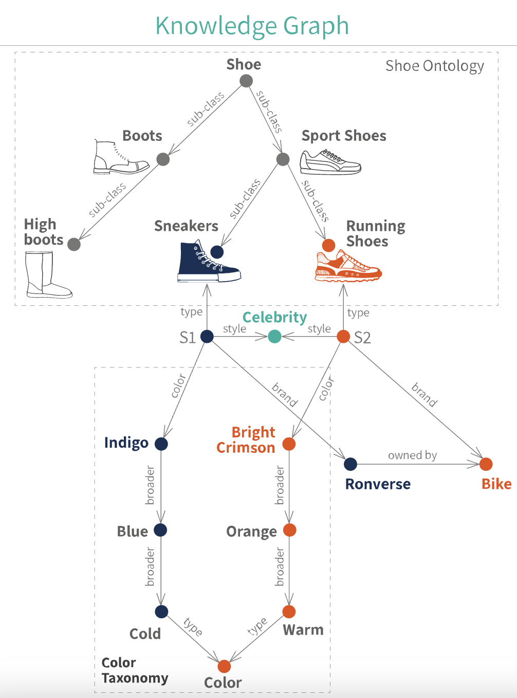
Help customers search for products
-
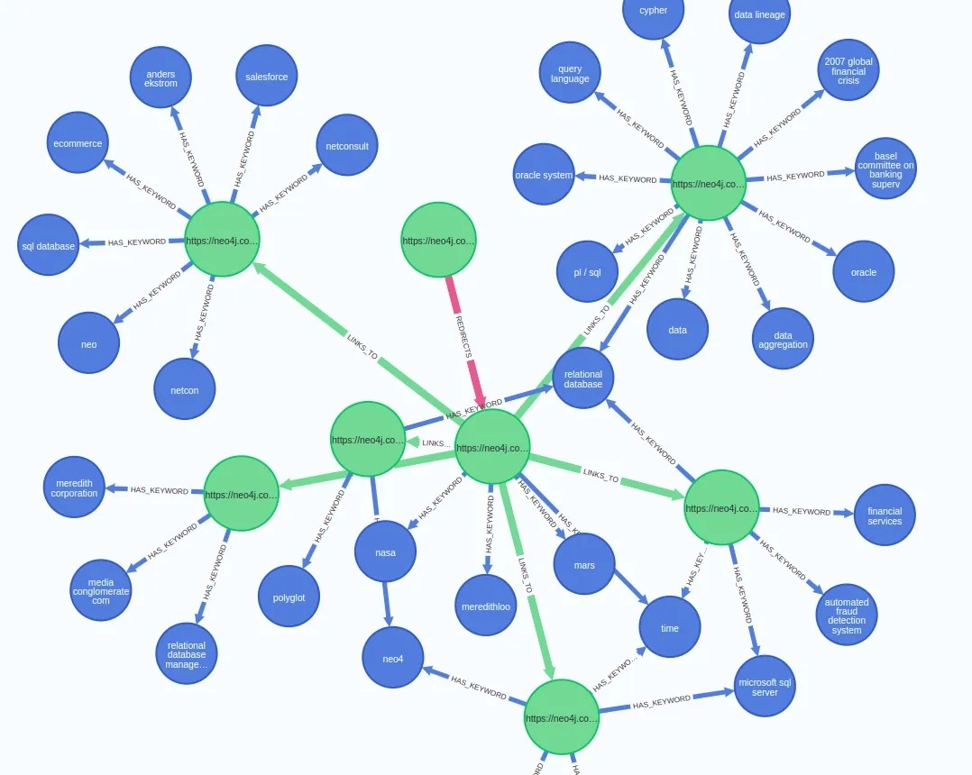
Help them navigate your help pages
 Source: Medium
Product recommendations
Returning customers are the most profitable part of any business. They're much easier to convert, and they tend to spend more than new customers.
The key to effectively leveraging your existing customers is to provide them with a great experience they want to repeat and to keep them in touch with new product releases, deals, and other helpful communications.
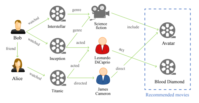
The mechanism behind this process is like the one happening for movie recommendations in some streaming services:
 Source: Medium
Likewise, retail companies send customers product recommendations based on demographic information and purchase history.
For example, if you know they're a parent, you can recommend toys. If you know they bought a changing table from you, recommend the matching crib and dresser.
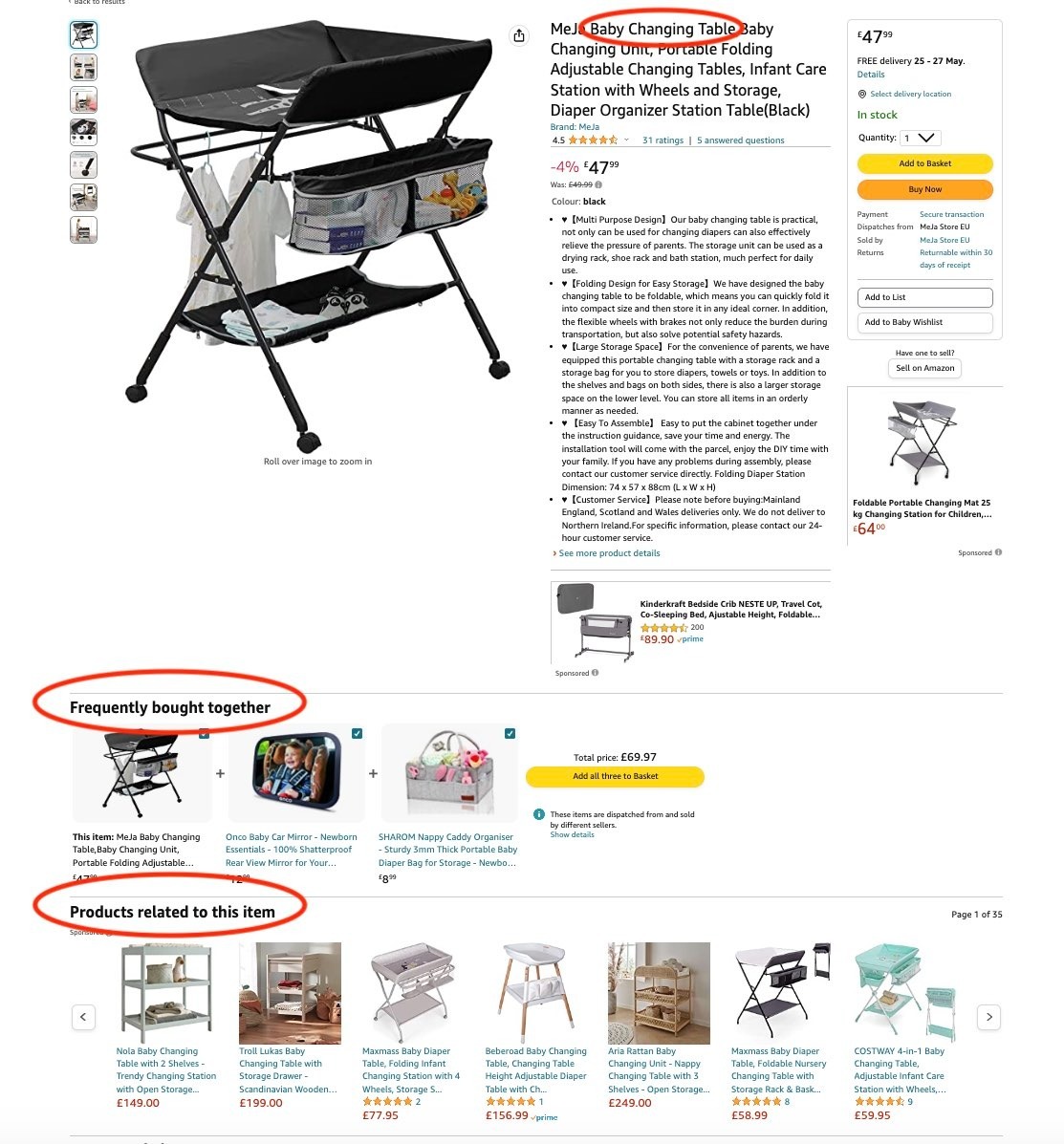 Source: Amazon
Challenges and implementation frameworks
The biggest challenge in knowledge graph visualization is taking all the random, unstructured data from its various data storage mediums and silos and converting it into structured, centralized, usable information.
Data is information without context. While you have no problem looking at various kinds of data and understanding the context that makes it useful, computers have no such ability.
(Which is why humans build algorithms to tell them what to do)
Take a list like this, for example:
You can look at that list and know that one is a video platform, one is a cereal brand, and one is a car manufacturer. A computer just sees random words without that context.
Metadata, or information about data, provides the context required for computers to understand that. This is done via ontologies that describe categories, nodes, and relationships.
With the proper framework (e.g., Extensible Markup Language (XML) used on websites and Resource Description Framework (RDF) used by business solutions) computers can understand what data means, what it's about, and how it's connected.
This semantic layer makes it easier to search for information because the system understands what you're asking for.
Even when systems use different terms to label the same things, a comprehensive semantic network can recognize that these are synonyms and provide the complete data set for the concept and all its descriptors.
Benefits
Visualizing knowledge graphs offers several benefits that enhance understanding, exploration, and analysis of complex information networks.
Here are some benefits of knowledge graph visualization.
Improved comprehension
Knowledge graphs often contain vast amounts of interconnected data, making it challenging to grasp their structure and relationships.
Visualization techniques make it easier to understand complex information by presenting it in a visually intuitive and accessible manner. Users can quickly identify patterns, clusters, and hierarchies, leading to a deeper comprehension of the underlying data.
Enhanced exploration and navigation
Visual representations of knowledge graphs allow users to explore and navigate the data more effectively. Through interactive interfaces, users can interact with the graph, expand or collapse nodes, zoom in or out, and navigate through different levels of abstraction.
This flexibility enables users to uncover hidden connections, explore different paths, and gain insights that might not be immediately apparent in a textual or tabular representation.
Facilitated knowledge discovery
Visualization aids in knowledge discovery by highlighting relationships and connections between entities. By visualizing the graph, users can identify clusters of related information, detect outliers, and reveal previously unknown associations.
This can lead to the discovery of valuable insights, correlations, or patterns that might otherwise go unnoticed.
Support for decision-making
Visualizing knowledge graphs can assist in decision-making processes. By presenting data visually, decision-makers can better comprehend complex scenarios, assess the impact of potential decisions, and identify potential risks or opportunities.
Visualization provides a more holistic and intuitive understanding of the information, leading to more informed and confident decision-making.
Effective communication
Knowledge graph visualization is an effective means of communicating complex information to diverse audiences. Visual representations can simplify the presentation of intricate concepts and relationships, making it easier for non-experts to grasp the content.
Visualization facilitates effective communication and knowledge sharing among different stakeholders, enabling collaboration and fostering a shared understanding of the information.
Integration of diverse data sources
Knowledge graphs often integrate data from various sources and domains. Visualization allows users to see the connections between these disparate data sources, enabling them to explore relationships that span multiple domains.
This integration can provide a broader perspective and enable cross-domain analysis, leading to new insights and discoveries.
Knowledge graph visualization for explainable AI
Visualization has become the interface for verifying what enterprise AI systems retrieved, reasoned over, and cited. It can help turn AI-supported answers into inspectable paths, showing which entities, relationships, and sources contributed to the result.
Here's the mechanism. When a GraphRAG system answers a question, it traverses entities and relationships in the underlying graph rather than matching loose text. Visualization surfaces that traversal, so a compliance officer, researcher, or analyst can see which policy, regulation, trial, or document supported the answer, and follow the same path themselves.
That changes what review looks like. Instead of reading an answer and deciding whether it sounds right, your domain expert inspects the route the system took: these entities, these relationships, these sources. In GraphRAG workflows, retrieval can be designed so that the entities, relationships and sources used by the system are recorded and made easier to inspect.
There is one precondition worth being honest about. A visualization is only as trustworthy as the graph beneath it. If two systems define “adverse event” differently, the picture will look coherent while the meaning underneath drifts. A governed ontology, maintained through ontology management, and a semantic layer for AI readiness are what keep the picture and the meaning aligned.
That's why knowledge graphs and GraphRAG work best as an architectural foundation rather than a UI feature. The visualization is the window. The governance is what makes the view accurate.
Types of KGs visualization tools
Many tools can aid you in creating your knowledge graph visualizations. Here are some of the most popular tools available:
Databases: Many databases are available to help you store your information. The right database will vary by business and use case. Examples are RDF databases and the OWL language.
-
RDF databases are specialized databases that store and manage data using the Resource Description Framework (RDF) model. RDF represents information as subject-predicate-object triples, enabling flexible and scalable data integration and querying.
-
OWL (Web Ontology Language) is a semantic web language that allows the creation and sharing of ontologies, which are formal representations of knowledge domains. OWL provides a rich vocabulary for expressing complex relationships and logical constraints, enabling advanced reasoning and inference capabilities for knowledge-based systems.
Together, they form a powerful combination for managing and reasoning with structured data, facilitating semantic interoperability and intelligent information processing in various domains.
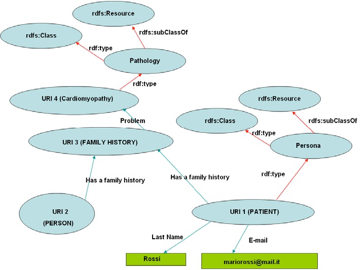
Source: Research Gate
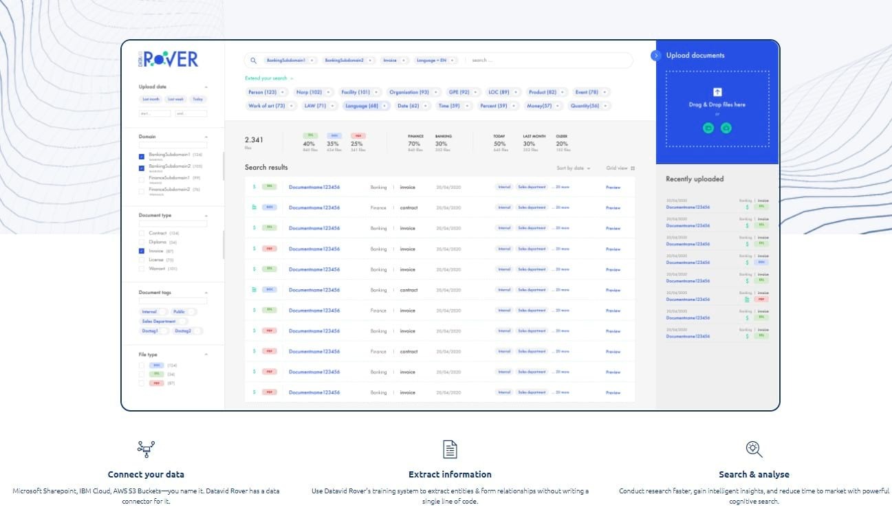
Data intelligence platform: A platform like Datavid Rover lets you connect your data, extract insights, and run fast, easy searches. Datavid Rover is not simply a graph visualization tool. It is an implementation accelerator for building governed enterprise knowledge graphs and semantic foundations that can support search, analytics, GraphRAG, and AI applications.
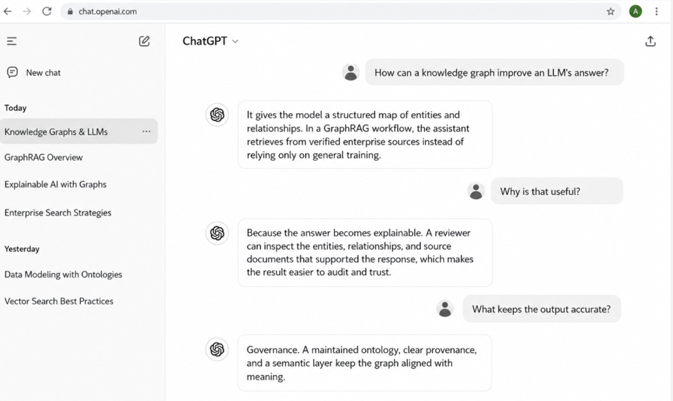
Language model: A large language model (LLM) integrated with a knowledge graph can help your system understand search queries, with retrieval grounded in verified enterprise sources rather than the model's general training data.
Machine learning platform: A machine learning platform like Google's TensorFlow can help you analyze your unstructured data.
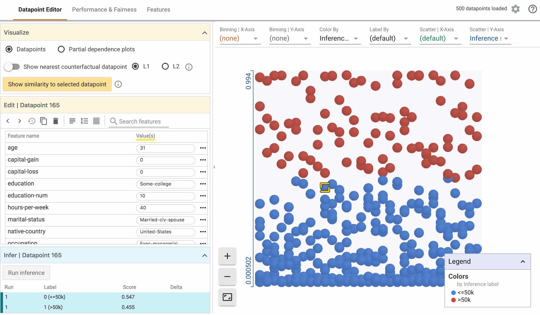
Source: Google TensorFlow
Find the right tools
Choosing the right tools is crucial when visualizing knowledge graphs effectively. A good tool helps display connections clearly and ensures the graph structure is built to support powerful, scalable exploration.
Progress MarkLogic FastTrack
MarkLogic FastTrack is a UI component library designed to help organizations rapidly develop search and visualization applications to explore connected data.
It is specifically designed for MarkLogic Server, a popular multi-model database that can store and search the graph data and the knowledge model necessary to build a knowledge graph.
Besides the knowledge graph visualization component, FastTrack provides other UI components like faceted search, chat, and text preview that communicate directly with the data stored in the database so developers can build complete end-user applications.
This enables teams to move quickly from raw data to fully operational, visual knowledge graphs, allowing experts to intuitively explore relationships, uncover insights, and interact with complex data structures.
Here is an example of a knowledge graph visualized with MarkLogic FastTrack setup:
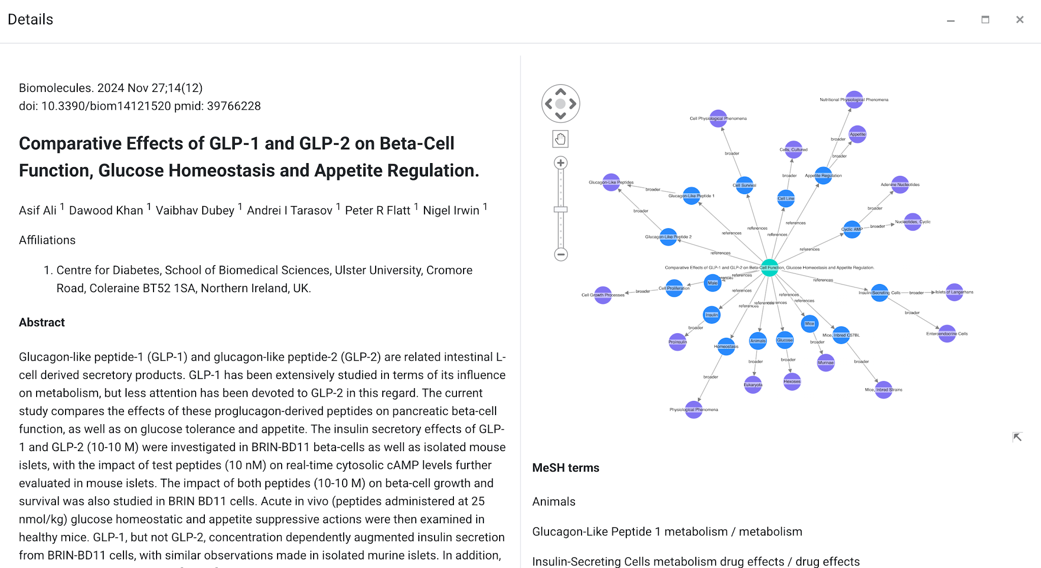
Source: Progress MarkLogic
Cytoscape
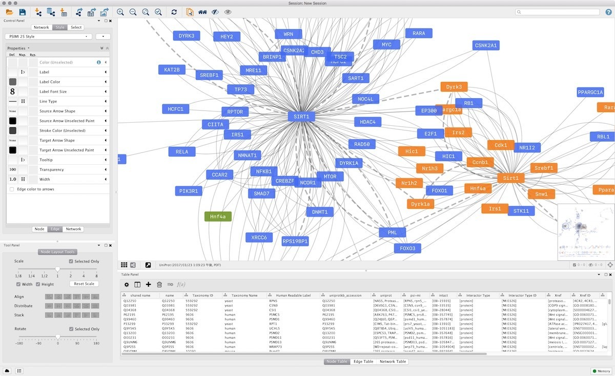 Source: Cytoscape
Cytoscape is a versatile and widely-used open-source tool for visualizing and analysing complex networks, including knowledge graphs. It offers a range of layout algorithms, styling options, and interactive features to create visually appealing and interactive visualizations. Cytoscape also provides various plugins and extensions for advanced analysis and customisation.
Gephi
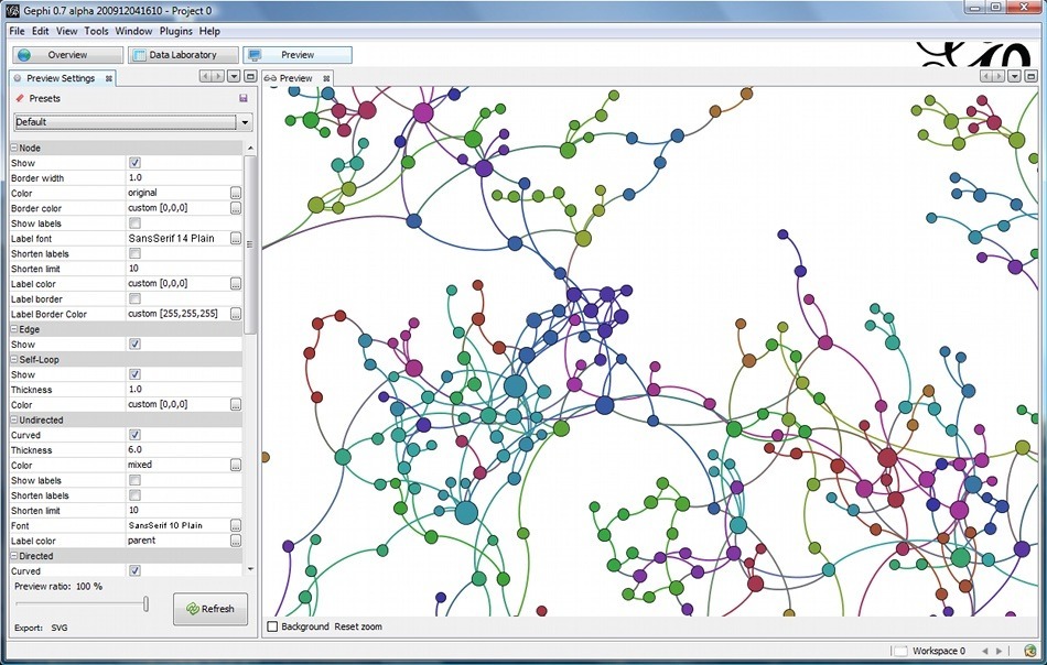 Source: Gephi
Gephi is an open-source graph visualization and exploration tool that supports various graph formats, making it suitable for visualizing knowledge graphs. It offers a user-friendly interface with various layout algorithms, filtering options, and interactive visualization features. Gephi is particularly known for its ability to handle large-scale networks efficiently.
KeyLines
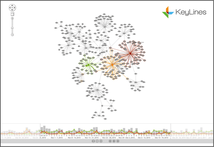 Source: Dataversity
KeyLines is a commercial JavaScript toolkit for building interactive and visually appealing graph visualizations. It provides features like zooming, filtering, and dynamic querying to explore and interact with knowledge graphs effectively. KeyLines offers customization options and supports integration with various back-end technologies.
Other tools
Neo4j Bloom is a visualization and exploration tool built for the Neo4j graph database; teams reach for it when their graph already lives in Neo4j, and they want intuitive, no-code exploration.
Graphwise GraphDB is a semantic graph database for RDF data; it fits when you need scalable graph storage, SPARQL querying, reasoning, and semantic search, with visualization and exploration tools available on top.
Stardog is an enterprise knowledge graph platform for integrating, modeling, managing, querying, and exploring connected data; teams choose it when data integration and ontology modeling need to sit alongside SPARQL querying and visual exploration.
Want to understand whether your knowledge graph is ready to support search, analytics, or AI? Get a free assessment